Most analytics reports aren’t very helpful because they show you data without telling you what to do with it. If you’ve ever opened a dashboard, scrolled through a wall of charts, and closed the tab feeling no clearer than before, I understand your frustration.
I’ve seen this pattern play out with small website owners more times than I can count. Someone spends an afternoon building a dashboard, checks it twice, and never opens it again. The report wasn’t built to help one person make one decision. It was built to look thorough.
In this article, I’ll break down why reports fail and what a reporting habit built around action looks like instead.
The Problem With Most Analytics Dashboards
Most reports overwhelm you with data that has no connection to what you’re trying to accomplish. That’s the core issue, and it’s baked into how most analytics dashboards are designed.
A typical GA4 dashboard shows:
- Sessions
- bounce rate
- engagement time
- pages per session
- traffic sources
- and device breakdowns.
And the truth is, when everything looks the same, nothing stands out.
I’ve also noticed the people who struggle most with analytics aren’t the ones who lack data. They simply have too much of it, and no clear signal telling them what matters.
These reports are built for teams with dedicated analysts, not for a solo site owner fitting analytics between content updates and client work.
If reading a report doesn’t change what you do next, the time you spent on it was wasted.
Four Reasons Your Reports Aren’t Working
Analytics reports fail because it’s hard to trust the data, the audience is unclear, and nothing is built for action. Here’s how each one plays out:
| Problem | Why It Happens | What It Causes |
|---|---|---|
| Data quality issues | Tracking code is misconfigured, filters are missing, or events fire incorrectly | Numbers don’t match reality, so you stop believing the report |
| One-size-fits-all dashboards | Default templates try to serve every role at once | No one sees what they need, so no one checks |
| Vanity metrics front and center | Pageviews and sessions look impressive but don’t connect to goals | You feel informed but don’t act |
| Report sprawl | New dashboards get created for every question, then abandoned | You don’t know which report to trust |
Why You Stop Trusting Reports
When your GA4 sessions don’t match your hosting stats or your CRM shows different lead counts, you start second-guessing everything.
GA4 samples data on larger sites, so the numbers aren’t always exact. Ad blockers and consent banners widen the gap between real and reported traffic.
I’ve talked to site owners who stopped checking analytics entirely because of this, and honestly? I get it. Once you’ve seen the numbers not line up twice, you just stop checking.
Why Polished Dashboards Still Get Ignored
A clean analytics layout with branded colors still gets ignored if it doesn’t serve a purpose. Design doesn’t fix a missing goal.
From what I’ve seen, the dashboards that get abandoned fastest are the ones with the most charts. Every widget competes for attention, and nothing tells you where to look first.
The bigger issue is that most dashboards sit in a separate tab with no connection to your daily workflow. There’s no prompt, no schedule, and no next step. If checking a report feels like a chore you have to remember, it won’t survive the first busy week.
What a Useful Analytics Report Actually Does
A useful analytics report tells you what changed, why it matters, and what to do next.
You can’t get to that point though without picking a goal first. Without one, every metric feels equally important, and you end up tracking everything without acting on anything.
Most small sites have one primary goal at any given time: leads, sales, bookings, or email signups. Once you know yours, you only need 1 to 3 supporting metrics.
Here’s how that looks by site type:
| Site Type | Goal | Metrics to Track | Decision It Supports |
|---|---|---|---|
| Service business (plumber, consultant, agency) | Generate leads | Form submissions, service page visits, traffic source for leads | Which service page to improve or promote next |
| Blogger or content creator | Grow audience and email list | Email signups, top-performing posts, returning visitors | Which posts to write more of or update |
| Ecommerce store | Drive sales | Conversion rate, revenue per session, cart abandonment rate | Where to focus to increase revenue this month |
A Simple Reporting Workflow That Doesn’t Get Ignored
Reporting works when it’s short, consistent, and tied to one decision per cycle. The moment it takes more than 10 minutes, it starts getting skipped.
Here’s the workflow I recommend:
- One schedule. Pick a day and time. Tuesday morning works well because you have a full week of data.
- One owner. One person is responsible for checking the report and flagging changes.
- One decision per cycle. Every check should end with one thing to change, test, or keep doing.
- Weekly check, monthly review. The weekly check takes under 10 minutes. The monthly review is where you ask whether the goal itself still makes sense.
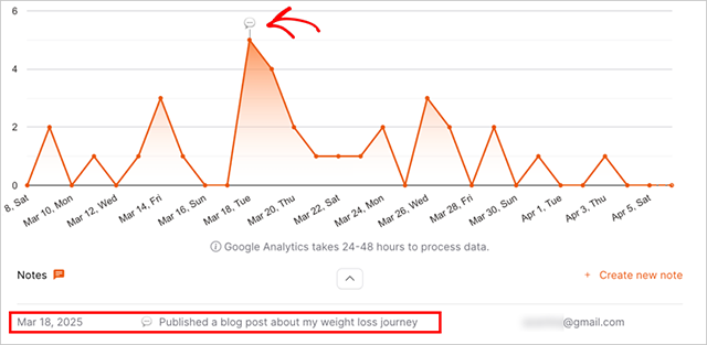
- Notes on what changed. Write one sentence each week about what you noticed. After a month, you’ll have a record of what’s working.
I’ve found that the notes part is what makes this stick. Without them, every week feels like you’re starting from scratch. Even one sentence gives you something to compare against.
The hard part is doing it consistently, not doing it perfectly.
Of course, even a good workflow depends on you remembering to check. That’s one of the reasons I use OnePageGA.
How OnePageGA Keeps Reporting Short and Actionable
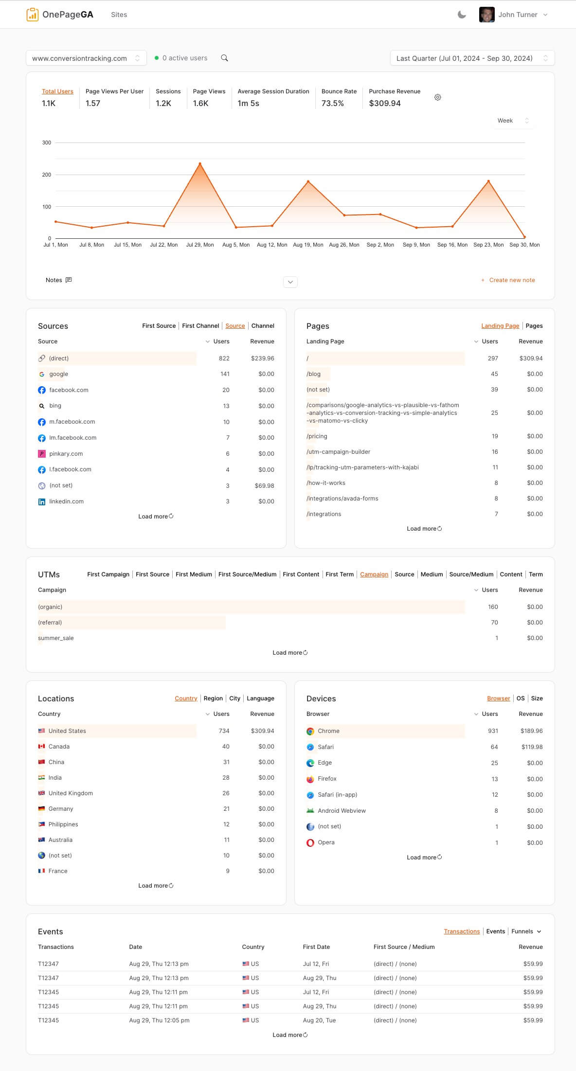
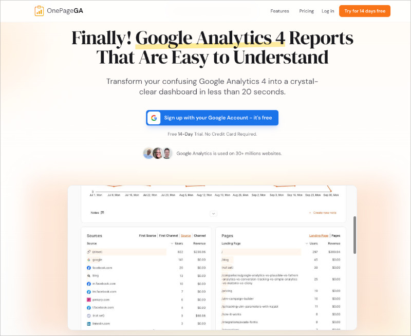
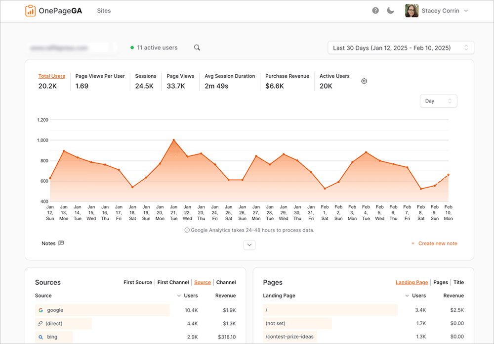
OnePageGA strips reporting down to what helps you decide, not what looks impressive. It’s a clean dashboard that pulls your Google Analytics data into a single, easy to understand page. The one-page layout forces every metric to earn its spot, so you’re not starting from a blank dashboard wondering which widgets to add.
I use OnePageGA because it fits the kind of workflow I described above. You open it, see what shifted, and decide what to do. There’s no exploration required, which is a game changer compared to GA4.
But the feature that changed my weekly routine the most is AI Weekly Insights. Every Monday morning, OnePageGA sends a personalized report to your inbox with week-over-week comparisons, top traffic sources, and a few sentences of AI-written analysis explaining what changed and what to do about it.
You don’t have to log in or remember to check anything. The report comes to you, in plain English.
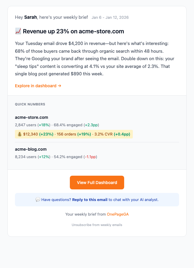
If you run an ecommerce site, the email also includes revenue, orders, and conversion rate changes. And if something in the report raises a question, you can reply directly to the email and ask a follow-up. OnePageGA’s AI responds with context-aware answers based on your data.
That’s exactly the kind of reporting this whole article is about: short, focused, and built to help you act.
FAQs About Analytics Reports
Why do analytics reports show different numbers in different tools?
Tracking rules, attribution models, time zones, and data sampling can all change totals. GA4, your CRM, and your ad platforms each count visitors differently. Small gaps are normal, but large differences usually point to a misconfigured tag or missing filter.
How often should you check analytics if you are short on time?
A weekly quick check and a monthly review is enough for most small sites. The weekly check covers what changed. The monthly review covers whether your goal still makes sense.
Which GA4 reports are actually worth looking at?
Focus on acquisition, engagement, and conversions, each tied to one goal. Ignore the rest until you have a specific question that needs deeper data.
Do you need an analytics dashboard if you only run one website?
A single focused report is usually better. Dashboards are designed for teams managing multiple data streams. One site with one goal needs a simpler view.
Analytics reporting is a communication problem, not a data problem. Most reports fail because they were never designed to help you decide anything.
The good news is that fixing it doesn’t take much. Start with one goal, track a few numbers that show progress, and build a short weekly habit around it.
If your current analytics setup isn’t doing that, OnePageGA is a good place to start fresh.
You may also find the following analytics guides helpful:
- Simple Google Analytics Reports
- How to Track Website Visitors
- Easy Google Analytics 4
- Content Marketing Metrics That Matter
If you have questions or want to join the conversation, you can also find us on X and Facebook.